
Colour Harmony and composition
Discover in this blog, practical insights on overcoming blank paper fear with effective strategies for artists. This art blog provides tips on how to create a colour harmony and composition. With a smaller colour palette, you can enhance and improve your skills for stunning artwork.
Michelle N White Art
5/17/20252 min read
Facing the Blank Paper: A Friendly Guide to Painting from Composition
Let’s be honest—when you sit down to turn a composition into a painting, it can feel a bit intimidating. That sense of stage fright? Totally normal. In fact, every artist, no matter how experienced, knows that nervous flutter. It's part of the creative process.
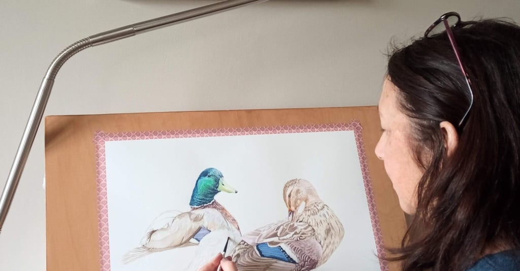
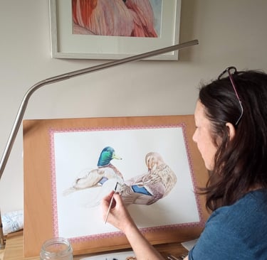
When I approach a composition, I like to think of it as a guide rather than a strict blueprint. Even though I paint in a realistic style, I always bring a personal touch to my work. I take my time with the reference photograph, studying every little detail—colours, tones, shapes—and deciding what should stay, what can go, and what I want the viewer to truly see.
Sometimes, I want the focus to be on one key detail; other times, it's about the full subject. There’s no rule—it really depends on what I feel drawn to in that moment.
Here’s something I’ve learned over time: Start with the part of the composition that speaks to you most. What needs to be there first? Begin with that. The rest will come together naturally. Allow yourself to flow with the painting process. Let it guide you. That’s where the magic of discovery happens.
When it comes to colour, don’t stress too much about getting it perfectly like the reference photo. Photographs can miss subtle shifts and depth. I like to mix colours that not only align with the reference image but also resonate with my own artistic voice. That means choosing colours I love and that represent my style—while still making sure they fit the composition.
Practicing colour mixing on your palette before you start painting is so important. Take a moment to play around, find combinations that match the photo (or your memory, if the photo isn't clear), and see what works. You might even look at a few different references—or observe the subject in real life if you can.
By limiting your palette to a small, thoughtful selection of colours, you’ll actually give yourself more freedom. You’ll create mixes that feel intentional, harmonious, and uniquely yours.
And here's a little colour-mixing tip I swear by: Always mix transparent colours with other transparent colours.Mixing them with opaque colours can quickly lead to muddy results, and that can disrupt the balance and cohesion of your painting.
So be kind to yourself in the process. Embrace the learning, the play, and the unpredictability. Your composition is just the starting point—you bring it to life.
Feel free to check my other blogs pots for valuable insights and my painting process. You can also watch a video on my YouTube channel that details the composition and colour palette featured in this blog, while working on this painting.
To read more about the inspiration behind the creation of this artwork, click the Portfolio page.
Artist
Michelle N White
Letters from Michelle's Studio
Stay informed!
Join the collectors list,
Be the first to receive personal reflections, new art collections, artistic learning insights and exclusive offers. Choose your preferred mail option.
Stay informed, join today!
© 2025. All rights reserved.